News and thoughts from CS Odessa, maker of the ConceptDraw product line: ConceptDraw PRO, ConceptDraw PROJECT and ConceptDraw MINDMAP.
Showing posts with label information visualization. Show all posts

Tuesday, June 11, 2013

Thanks, Marissa Mayer

Long time since last post... oh well. Blogging should be about posting when you have something to say, not because you need to put something up X times per X.

This reminds me of a time when I was hiking in the Enchanted Valley in the Olympics (WA state). We ran into a guy who was sitting in the middle of a soggy depression, staring at a thicket of devil's clubs (nasty plant!!). When we suggested to him that there was a great view just around the bend, he said, "No, I stop to rest every half hour. It doesn't matter where I am." But I digress... Back to Marissa.

It suddenly dawned on me today that mind mapping adherents owe her one for her whole no-more-telecommuting thing. I say that after a couple of hours spent searching with terms like "information visualization," "Idea visualization" and so on. The two results come together in a sentence like:

Use data viz to make sense of the data, and then come together with others and use your new-found insight to make a decision or reach a conclusion.

The thrust of her argument I think is that it is in those serendipitous meetings in the hallways that new ideas are born. I can agree with that--as long as people feel like they have the time and chat for a minute, and as long as they aren't worried about "owning" any idea that might spring forth.

I work from home now and sometimes miss that serendipity. I get it now when I visit my clients and at the organizations I volunteer for. It's one of the most entertaining and affirming parts of the work day.

Friday, April 12, 2013

Have you laid eyes on eagereyes?

Making the seredipitous choices that constitute the average Internet experience, I found a site today called eagereyes.org. If you're interested in the visualization of information (and if you mind map, how could you not be?), then you might like this site.

The site is run by Robert Kosara, a Visual Analysis Researcher at Tableau Software, and formerly Associate Professor of Computer Science at UNC Charlotte. He says on the site that "He has created visualization techniques like Parallel Sets and performed research into the perceptual and cognitive basics of visualization."

A recent post is called The Revolution Will Be Visualized. Here's an example of one of the data visualizations, this one on the number of gun deaths in the U.S. in 2013:

Here's another way to look at the data:

Not the cheeriest subject matter, I admit. But it does give you a aense of the power of information graphics. Where is the cross-over between mind mapping and information visualization? What does that Venn diagram look like?

Tuesday, November 20, 2012

Prepare Now for the Next Hurricane Sandy: Communicate Critical Information Faster, Clearer

"MINDMAP's visual interface gives the emergency planning team and our front line hospital staff a clear picture of what needs to happen in each emergency." Jill Collins

A Southern Hospital Creates Rapid-Action Planning
Jill Collins is an emergency management coordinator for a not-for-profit hospital in South Carolina. Part of her job includes managing the protocols, procedures, and policies put into place to deal with threats to the delivery of quality patient care. Collins uses ConceptDraw MINDMAP to manage and communicate planning and preparations for all of these potential problems.

Hobie: You missed the brunt of Sandy, but you still feel motivated to create an emergency plan?
Collins: Our hospital is accredited by The Joint Commission, which requires that we have a comprehensive emergency management program. Thankfully, true emergencies are infrequent... things like bad weather, chemical events, utility failures. Any one of these can compromise the hospital’s ability to function. Keeping staff prepared for events like these is an ongoing challenge. Hobie: Planning your response to emergencies like these must be very complicated. How do you manage it?
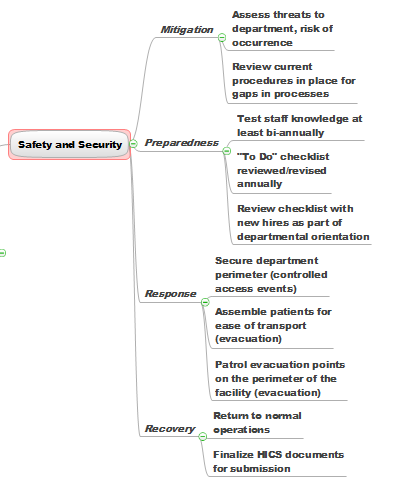
Collins: For each hazard, there are four phases of emergency management: mitigation, preparedness, response, and recovery. Within each of these four phases, the Joint Commission identifies six critical areas: communication, resources and assets, safety and security, patient management, staff responsibilities and utility management.

Inside of that overall planning, I need to be able to communicate specific plans for dealing with hazardous drugs and materials, medical equipment, utility safety, and the near-constant construction projects going on around the hospital. Then I have to explain each of these in relation to the five most likely emergencies, lay out planning for the four phases, and then show how we're prepared for the six critical areas in each phase.

Hobie: I can see how mapping would help. But how did you come to use it?
Collins: I first saw MINDMAP at a Fred Pryor professional training seminar and decided to see if it could help with this presentation. I opened up the program and just jumped into some really complicated brainstorming.

Once I finished that, I went back in and organized everything and added some additional information. Then I pushed a button and exported the whole thing into a PowerPoint presentation. I’ll tell you, seeing the PowerPoint presentations suddenly appear was the coolest thing since sliced bread. And I was just so tickled, because that was my first time using MINDMAP.

Hobie: So you use MINDMAP as a planning tool, then share it as PowerPoint slides?
Collins: No, no. That's just when I need to share an overview with management. Our hospital uses HICS, Hospital Incident Command System, a planning framework that assigns specific job tasks for each staff person’s role in the emergency. MINDMAP's visual interface gives the emergency planning team and our frontline hospital staff a clear picture of what needs to happen in each emergency.

It can also help me get buy-in on the planning since it clearly lays out each person’s role and the impact that role has in our overall handling of the emergency.

Needless to say, being able to confirm their role with a quick glance at a visual map is much easier for staff than having to plow through a text document or decipher a spread sheet.

Hobie: Do you use MINDMAP in any other ways at the hospital?
Collins: We use it when we need to put our heads together and make sure we’re considering all the angles. "Is this one response recovery mode the duty of one nursing only? Or is it nursing and maybe respiratory therapy too—and maybe radiology." MindMap gives us the ability to collaborate on these questions and leave meetings with clear action plans.

Hobie: What would you say is the one big advantage MINDMAP offers over other ways you've tried to communicate complex information to people?
Collins: In any business situation—especially ones when tension can be high, the less wording and more action-oriented items you use to convey information, the better people can focus on the job at hand. The visual display ConceptDraw MINDMAP presents helps everyone focus in on the big things, and helps make complex things much easier to understand and act on.

Learn more about how to use ConceptDraw MINDMAP to solve your business challenges.

Monday, November 5, 2012

See Your Sales Data Graphically, Updated Instantly

CS Odessa has a lot of interesting videos on its website. This one, called How to Connect Dashboard to Data, shows you how to connect data to any of the various visual dashboard tools available in ConceptDraw Pro.

The cool thing about this is that it's very easy to do. Some of us like nothing better than to see spreadsheets of data. But for the rest of us, this video shows how easy it is to take any data stream and connect it to a speedometer-type visual object, or different kinds of live bar graphs as shown in the image above.

ConceptDraw PRO reaches into your data source every 5 seconds and refreshes the visual object.

Pretty cool if you like to see your up-to-date sales pipeline at a glance.

Find out more about ConceptDraw PRO.

Friday, September 7, 2012

A Better Way to Manage PR Campaigns

I suppose that many of you, like me, wear more than one hat in the course of a working week. One of my hats is doing public relations. I love to find companies that are doing something great, but that don't know how to get out there and tell their stories. It is the writer in me that helps communicate what a company is all about--without it sounding like some kind of cheesy brochure.

But PR isn't a one-off thing: It's a process. It's about creating a plan, then executing the plan. And PR plans, like most plans are complex. There are a lot of dependencies. Mind mapping helps me merge my creative, writerly brain with my organizational brain.

There are a lot of moving pieces to the typical pr plan, so I thought I'd make a few short blogs about it so you can see how ConceptDraw MINDMAP helps me work quickly and creatively on behalf of my clients.

PR success is all building strong relationships with influencers, and in having clear, compelling stories to tell. To build strong relationships, you have to understand the reporter--and keep track of your communications with them. Here's how I do it.

I have a set of maps where I keep my media contacts (I pull them from a media database I subscribe to). Every time I start a new campaign, I pull from that the names and info of the reporters I hope to work with on the campaign. The map looks something like this (though this map is very simplified):

I'm trying to keep these posts short, so I'll end it here. Tomorrow I'll talk about capturing your pr brainstorming.

Wednesday, August 11, 2010

How To Create A Visual Event Calendar Using ConceptDraw Office

Step 1. Create the events you are planning as a mind map using ConceptDraw MINDMAP.


Step 2. Select all topics by pressing Ctrl+A and then copy the map.


Step 3. Open ConceptDraw PRO and create a new document using the Calendar template from the Template Gallery. The Calendar template is located inside the Project Management category of the Template Gallery.


Step 4. Press Ctrl+V to paste the copied mind map information into the ConceptDraw PRO document workspace.


Step 5. Next drag and drop calendar shapes from the Calendars library to the document workspace for each topic of the mind map.


Step 6. To set the required date click on the date you want to identify and then change the font attributes for that date (color, size, type style). To navigate to a different date use the Action button menu to change months and years that are presented.


Step 7. Connect the mind map topics to the calendars using the Smart Connector tool located in the ConceptDraw PRO toolbar.


Result. The finished product is now an excellent visual plan of your important activities in the visual format of mind map.


Post Script: Of course it is also possible to use ConceptDraw PRO to build a date calendar and then use that visual information in a ConceptDraw MINDMAP topic. Our ConceptDraw products have the flexibility to work the way you want to work.


You can find out much more about our products here on our blog, or visit our web site for detailed information on each of our products. You are able to download a no obligation 30-day trial copy from this web page.

Tuesday, April 13, 2010

A Map to Drive IT Transformation

Jim at McGee's Musings blogs today about one man's attempt to help corporate executives demystify IT. You can read his review of "Blind Spot" by Charlie Field here. What interested me was his reproduction of a diagram in Field's book.

Here is the map as it appears in the book (click on image to enlarge):


I'm sure it's a great paradigm. But what I sometimes don't get is how anyone is supposed to actually use diagrams like this. It reminds me of a day-long seminar I went to once. The teaching event was centered around 100-plus PowerPoint slides (heaven help us), each one explaining key things we needed to do to be better at our jobs. It was good information. At the end of the event, the organizers ceremoniously went around to each attendee and handed them a 3-ring notebook with, you guessed it...100-plus PowerPoint slide reprints. How, I wondered, was anyone supposed to put into action the great resources we had been shown (and at a pretty price, by the way).

How much better to exchange document forms that people work with. Take, just for example, the same diagram expressed as a mind map (click on image to enlarge):


For so many people, the form in which we receive information can make it challenging to interact with that information. I guess that's what I love about mind mapping. It's so easy to add content, whether that content is your ideas, hyperlinks, hidden notes, icons, etc. It's so easy to drag and drop the information around, to quickly move to anywhere in that body of information to add new thoughts and ideas that come to you as you view the entire body (or a selected view of it) from "above."

Maps make normal linear documents seem so... so 20th Century.

Wednesday, February 10, 2010

Jim McGee, Hans Rosling, TED India: Wonderful Information Visualization

Jim McGee's blog, McGee's Musings (which, by the way, features this Dorothy Parker quote: "The cure for boredom is curiosity. There is no cure for curiosity.") has a really great video from TED 2007. In the video, Hans Rosling using information visualization like a master to create an engaging, compelling case for the imminent rise of China and Inidia.